Recovery Care
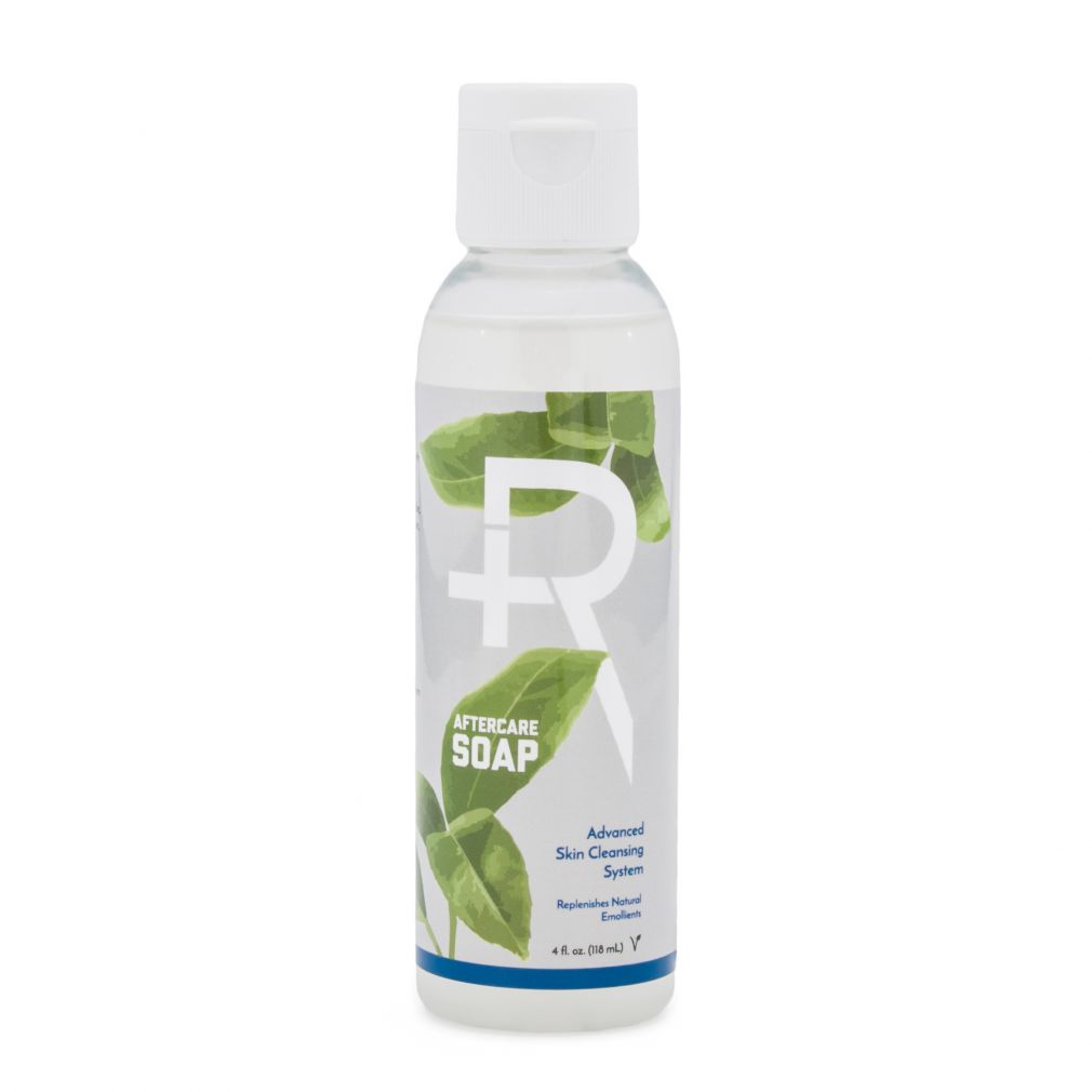
The Recovery Care line consists of various hygiene products and care products cleaning Body Jewelry. The packages prominently use green with hints of other recovery brand colors. Features imagery includes leaves of the plants which extracts can be found in each product.
Recovery Tattoo
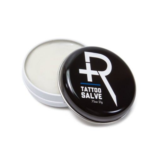
The Recovery Tattoo line consists of products for preparation and care of new Tattoos. The packages prominently use Black with hints of other recovery brand colors. Features imagery of smoke, and Ink.
Recovery Piercing
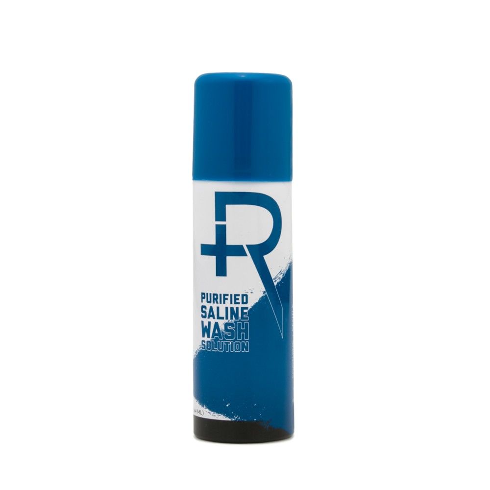
The recovery piercing line consists of various products for preparation and aftercare of Body Piercings. The packages prominently use blue with hints of the other recovery brand colors. Features imagery includes Water or Salt to reference its product offering.
Recovery Numb
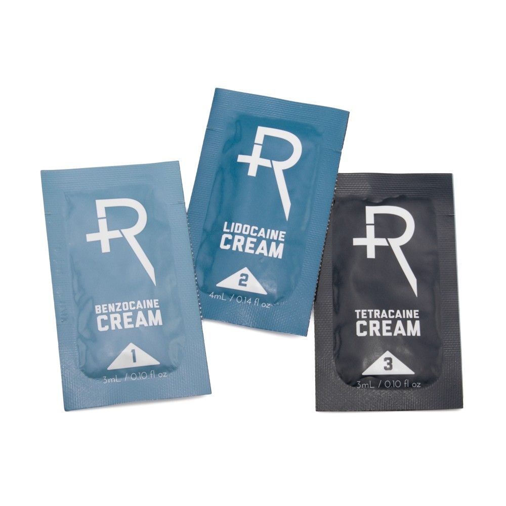
Recovery Aftercare began as a mission to ensure that body modification could receive gentle, all-natural, healthy treatment. Recovery’s line of products is sustainable, environmentally friendly, vegan-friendly, and organic. Recovery has developed an extensive family of products for a range of uses. The packaging of the recovery line consisted of over 20 products and corresponding POPs or displays. To best organize the product line, a well-defined product architecture was created so customers could easily understand the different family of products. The organization also gave customers an understanding that Recovery carried a trusted product for all of their needs. Each line features the Recovery “R” front and center, building brand consistency across retail locations. The Recovery Numb line consists of various numbing products for preparation and aftercare of body modifications. The packages prominently use grays and blacks with hints of the Recovery blue. Features imagery includes ice to reference its product offering. View the Recovery Piercing Line View the Recovery Tattoo Line View the Recovery Care Line
Body Arts Icons
The updated website design for PainfulPleasures, a worldwide leader in the manufacturing and distributing of tattoo and piercing supplies launched in 2017. The new website called for the creation of 160+ icons in multiple sizes to aid in the usability of the site. The icons were developed to voice a constant visual language that could be seen both large and small. The visual language follows standard web conventions with allowances for industry related imagery. The use of hierarchy and repetition was used to signify parent/child relationships. According to user reports the development of these icons increased usability and satisfaction when navigating the website. The icons also served as references to which pages had been visited and aided in the overall understanding of the site’s structure.
Obsidian Grip
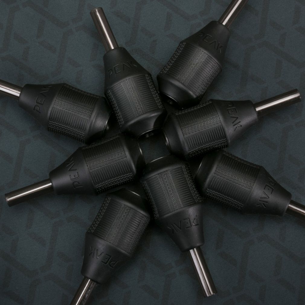
Manufactured by Peak, a tattoo technology brand which provides industry-leading products to tattoo professionals. The obsidian grip provides stability and precision control while tattooing. The design of the obsidian grips delivers ergonomics while reducing vibration so that artists can work more comfortably during extended sessions. The pattern on the grip is consistent with the patterning used in Peak branding. The repetition of the patterning increased brand recognition.
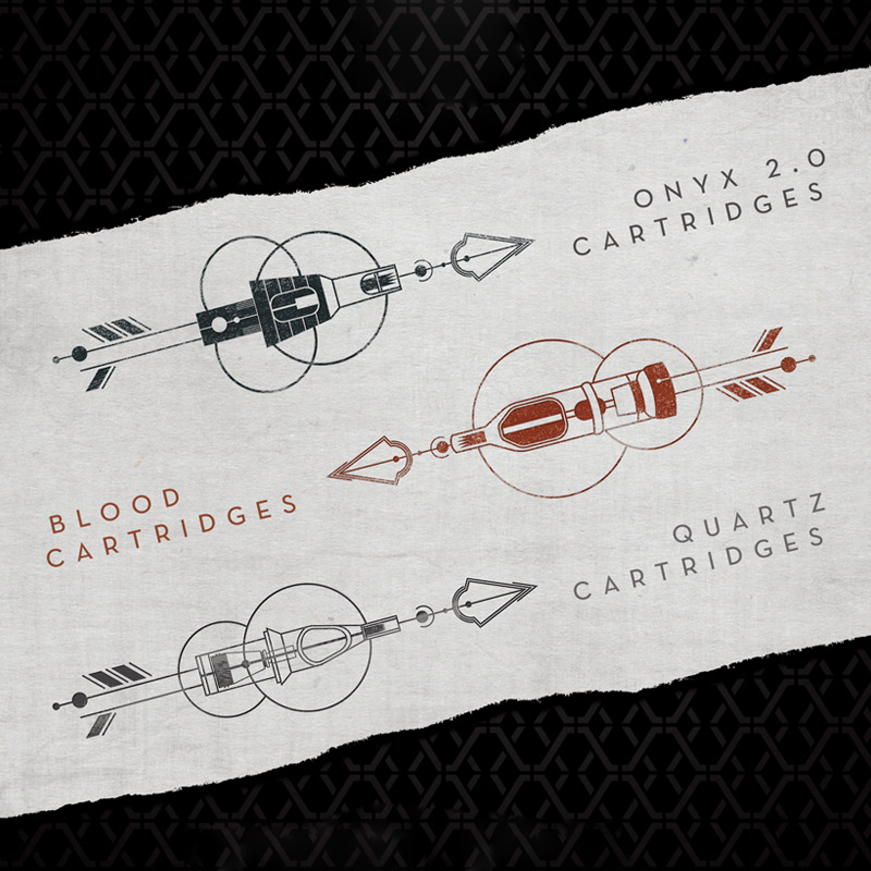
Peak Packaging
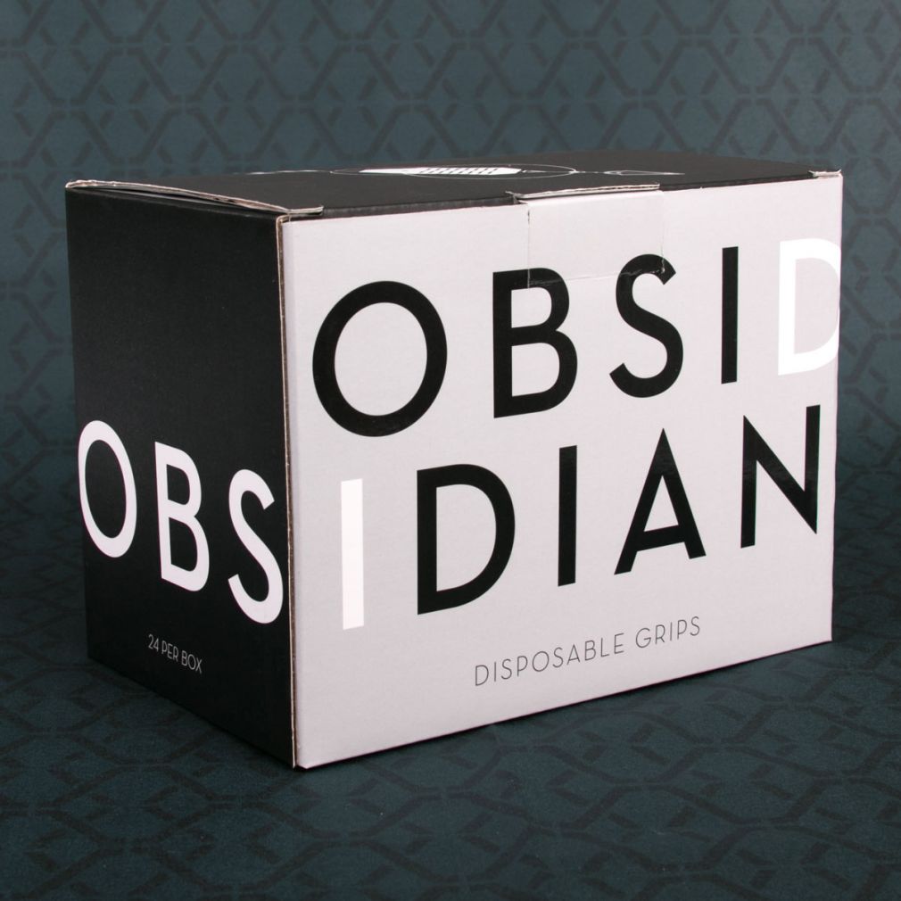
Peak is a leading provider of tattoo equipment, offering tattoo artists the tools necessary to leave a lasting mark. The packaging for Peak Products reflects the precision and simplicity of the brand. The packaging was divided into segments based on the product type, and a standards guide was written for each part, specifying the typography and color schemes. The needle and grip packages feature unique illustrations for each class. This project created in collaboration with staff at Painfulpleasures.com and Limitless Design The packages fit well in a crowded market, signifying the brand’s position without relying on cliché imagery or graphics. The guidelines drafted through this project laid the groundwork for consistency in future product packaging for the Peak brand.
Peak Ad
PEAK’s mission is to provide cutting-edge tattoo equipment for both new and experienced tattoo professionals. PEAK values heritage but remains future-minded. In designing an advertisement for both digital and print production for the Peak brand, the objective was to create imagery which fit within the visual vocabulary of the Tattoo industry, but with a future-minded focus. The dark and dramatic color palette intricate line work alludes to the work of tattoo artists while portraying a fresh visual language within tattoo product imagery. The elements used in this advertisement have been adopted as standard branding elements for Peak, further enhancing the company’s brand recognition.
Milkcrate Branding
The Milkcrate Creative Space is a multi-purpose facility managed by Limitless Design & PainfulPleasures. It serves as a premier venue for art exhibitions, panel discussions, lectures, seminars, classes, private events, and open houses. The Milkcrate name and graphical mark for this venue symbolize an approachable empty container ready to be utilized in many different ways. A monospaced sans serif font was used to play in the youthfulness and adaptability of the venue, with a grey and red color scheme to elicit energy and excitement.
Kolberg Invite
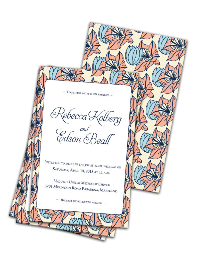
Looking to the symbolism of flowers and borrowing from the canon of William Morris, I created this illustrated pattern which merges a tulip symbolizing rebirth and a daffodil symbolizing renewal. This invitation and pattern were set with traditional and contemporary type to fit the personality of the happy couple embarking on a new journey.